<main class="container">
<section class="list-intro">
</section>
<section class="awesome-list">
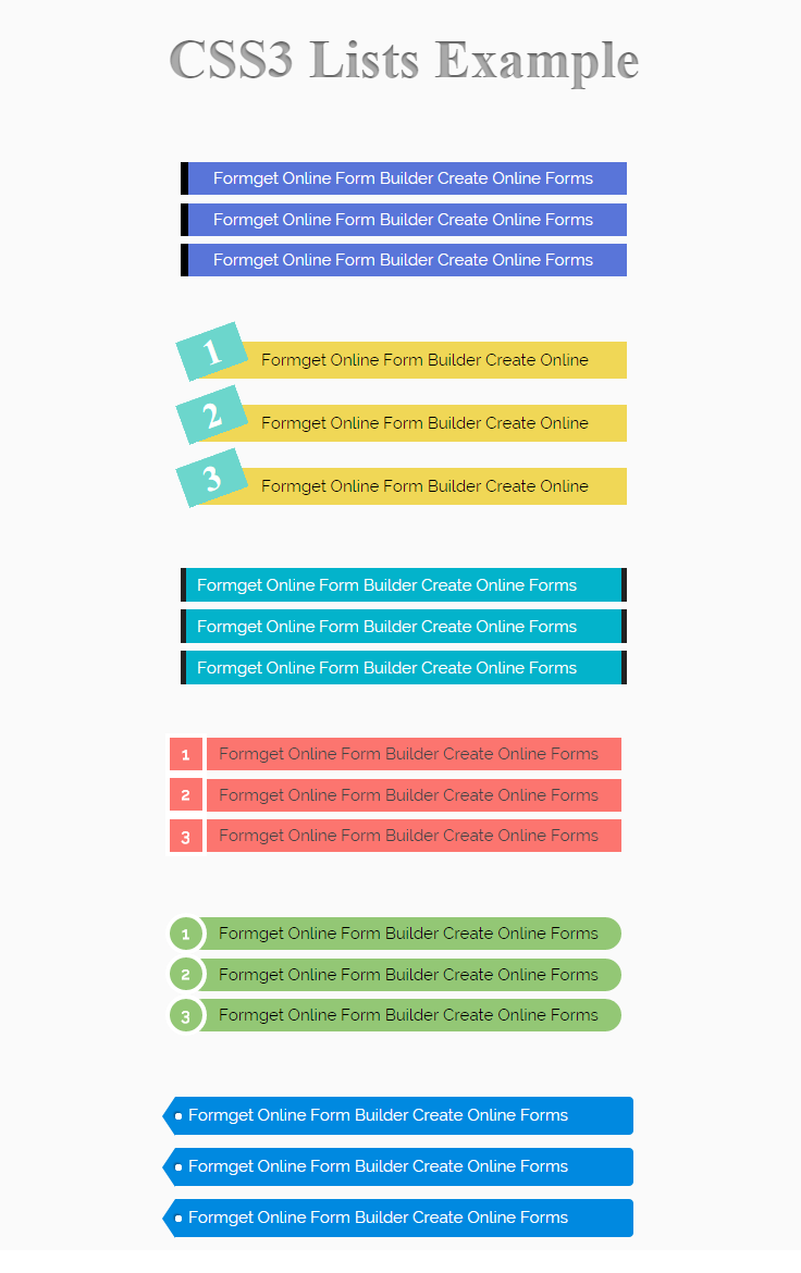
<div class="awesome-list-item"><span>Lorem ipsum dolor sit amet, consectetur adipisicing elit.</span></div>
<div class="awesome-list-item"><span>Illum placeat aut nam distinctio officiis dolore deset.</span></div>
<div class="awesome-list-item"><span>Dignissimos aliquam, velit odio magni mollitia quos recusate.</span></div>
<div class="awesome-list-item"><span>Labore quibusdam voluptatibus nobis minima reprehen.</span></div>
</section>
</main>
<style>
.awesome-list {
/* Create a new instance of a counter called "my-awesome-list" and set the counter to 0. */
counter-reset: my-awesome-list;
display: inline-block;
margin-left: -3.4em;
vertical-align: middle;
position: relative;
}
.awesome-list-item {
/* Increment the "my-awesome-list" counter for every list item. */
counter-increment: my-awesome-list;
margin: 1em 0;
position: relative;
width: 100%;
}
.awesome-list-item::before {
/* Display the counter and set the list style for the list. */
content: counter(my-awesome-list, decimal-leading-zero);
background: #FFF;
border: 10px solid #2C3E50;
border-radius: 50%;
color: #FFF;
display: inline-block;
font-weight: bold;
font-size: 1.8em;
line-height: 2.6em;
position: relative;
text-align: center;
vertical-align: middle;
width: 2.6em;
z-index: 2;
}
/* Everything else is just basic styling. */
html, body {
margin: 0;
padding: 0;
width: 100%;
height: 100%;
}
body {
background: #ECF0F1;
font-family: sans-serif;
font-size: 15px;
min-width: 600px;
}
.container {
margin: 0;
padding: 0;
width: 100%;
height: 100%;
vertical-align: top;
}
.list-intro {
background: #2C3E50;
color: #FFF;
box-sizing: border-box;
display: inline-block;
padding: 2em 4em 2em 2em;
width: 100px;
height: 100%;
vertical-align: middle;
}
.list-intro > h1 {
font-size: 1.4em;
}
.awesome-list-item > span {
background: #8E44AD;
border-radius: 4px;
color: #FFF;
display: inline-block;
position: relative;
line-height: 2em;
margin: 0 0 0 -2em;
padding: 1.2em 2em 1.2em 3em;
vertical-align: middle;
}
.awesome-list-item > span::after {
background: transparent;
content: "";
position: absolute;
top: 24%;
right: 2%;
width: 50%;
height: 50%;
max-width: 300px;
z-index: -1;
box-shadow: 0 15px 10px rgba(0, 0, 0, 0.4);
transform: rotate(3deg);
}
.awesome-list-item:nth-child(1)::before {
background: #8E44AD;
border-color: #2C3E50;
box-shadow: 0 0 0 3px #8E44AD;
}
.awesome-list-item:nth-child(1) > span {
background: #8E44AD;
}
.awesome-list-item:nth-child(2)::before {
background: #2980B9;
border-color: #2C3E50;
box-shadow: 0 0 0 3px #2980B9;
}
.awesome-list-item:nth-child(2) > span {
background: #2980B9;
}
.awesome-list-item:nth-child(3)::before {
background: #27AE60;
border-color: #2C3E50;
box-shadow: 0 0 0 3px #27AE60;
}
.awesome-list-item:nth-child(3) > span {
background: #27AE60;
}
.awesome-list-item:nth-child(4)::before {
background: #16A085;
border-color: #2C3E50;
box-shadow: 0 0 0 3px #16A085;
}
.awesome-list-item:nth-child(4) > span {
background: #16A085;
}
</style>
/*===============================End======================*/